UX/UI Design
Antonelli’s Cheese Shop
The Best Little Cheese Shop in Texas
Role
Lead UX/UI Designer (Research, Interaction Design, Visual Design)
Timeline
80 hours over 4 weeks
“We represent hundreds of artisanal producers making delicious and responsible food; learning their stories in person and then retelling them to our customers; and building a team of advocates for real food.”
Background
Antonelli’s, located in Austin, Texas, is a local cheese shop specializing in a curated selection of cut-to-order cheese, charcuterie and artisanal pairings. Since opening in 2010, they have grown out of their brick-and-mortar location and expanded to include a cheese house, which hosts classes and events, and a location at an upscale downtown foodcourt, Fareground, which serves a limited menu of hot items. Antonelli’s provides its customers a variety of ways in which to enjoy their products: in-person, delivery, and pick-up.
Problem
Antonelli’s needs help to improve their site usability and update their online presence, as well as maintaining and expanding upon their current brand.
Outcome
Antonelli’s new website improves areas of the customer experience: completing an online purchase, discovering information about producers, and seeking out employee expertise.
Research
Analyzing Secondary Data
I kicked-off the project by conducting initial market research to gain a better sense of the specialty food industry—recording what I already knew, figuring out the things I didn't, and looking specifically at competitors and their audiences.

Next, through competitive analysis, I formed a better understanding of the competition. I identified direct competitors, like Whole Foods and other local markets, as well as indirect competitors, like gift delivery services and farmers markets. For each, I analyzed their positioning in the market, strengths and weaknesses of messaging, offerings, and web presence.
View Market Research and Competitive Analysis here.
After identifying some demographics and habits of specialty food consumers, I created provisional personas to form a broad idea of what Antonelli’s customers might look like. These personas put into focus the interviewees I should target during user interviews, knowing they would lend the most useful insight and feedback.
Next, I familiarized myself with Antonelli’s current website. While conducting a site audit, I noted the site’s structure, hierarchy, visual look and feel, and usability. The existing architecture positioned the most popular information on the homepage, incorporating no real structure otherwise. But, the visual design of the site integrated elements that mimicked the feel of visiting the shop, which was important for me to maintain.
View Site Audit here.
Conducting Primary Research
Armed with information from existing resources, I gathered my own research specifically tailored to Antonelli’s needs. I created an interview guide to serve as a rubric during 1-on-1 interviews with current customers.
Assumptions
Customers live busy lives and find it difficult to make the dedicated trip to Antonelli’s (as opposed to a grocery store) as often as they would like.
Customers prefer an in-person experience when purchasing small orders of cheeses and pairings, while they prefer an online experience when purchase for larger events or gift orders.
Customers might be unsatisfied by the limited information on products and offerings listed on the website.
Customers highly value the expertise of the cheesemongers (employees) at Antonelli’s.
View Interview Guide here.
Over two consecutive days, I spoke with 7 customers on their experiences with Antonelli’s, other competitors, and their online purchasing habits as it related to food. I recorded each session, took notes on observations, and later transcribed my findings into a single document for analysis.
Research Synthesis
Uncovering Insights and Identifying Needs
With the feedback gathered during user interviews, I created an empathy map to synthesis my findings. Observations and statements were organized on virtual sticky notes, then repetitive information was paired together, identifying themes and patterns.
Groupings uncovered user insights, then needs were identified.
Insights
Customers value employee’s knowledgeable insight.
Customers make purchase decisions based on convenience.
Customers like to try before they buy.
Customers desire to support local producers.
Customers want to feel like they are purchasing quality products.
Customers are comfortable purchasing food items online.
Needs
Customers need interactions with knowledgeable employees.
Customers need convenient purchasing options.
Customers need to have confidence in what they buy.
Customers need to be aware of the local producers they are supporting.
Customers need to feel like the price matches the product.
Customers need the ability to purchase food items online.
View full Empathy Map here.
Creating an Ideal Customer
Jasmine is the primary persona that emerged as a composite of my research findings. Jasmine is busy career woman living in Austin, Texas. She is a foodie that balances her career with an active social life, placing importance on experiencing new things. She values convenience and supporting local businesses and makers.
Define, Ideate + Strategize
Defining the Design Problem
With a persona assigned, I moved into translating the insights and needs of Jasmine into defined Point of View Statements, then crafting a set of How Might We Questions to guide my design. Translating the problem into open ended questions, as opposed to statements, leaves more room for discovering solutions.
How might we make purchasing more convenient for Jasmine?
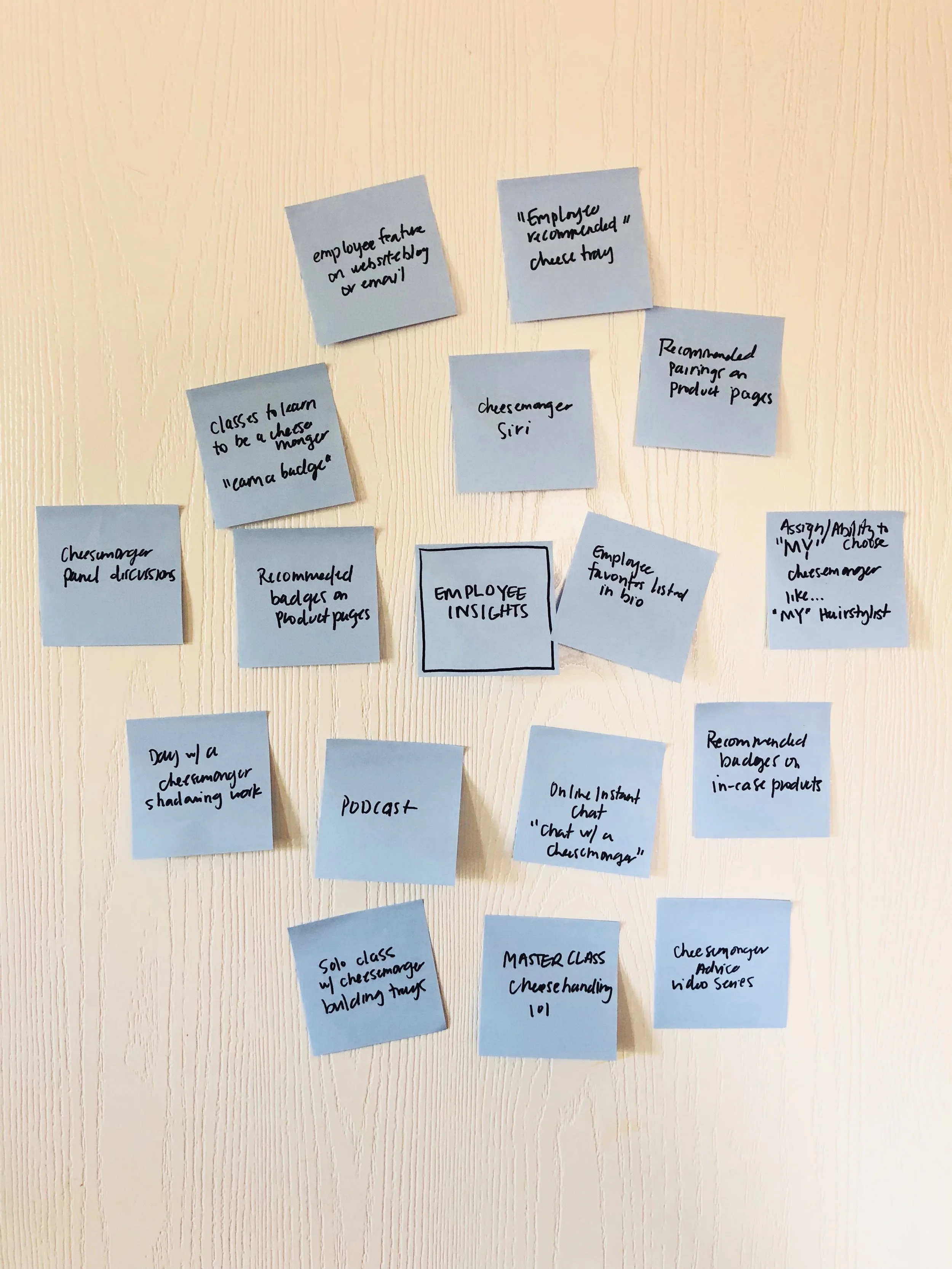
Generating Ideas
For each HMW Question, I conducted a brainstorming session to ideate solutions. The goal here was to generate as many ideas as possible in a short amount of time, which I could finesse later on.
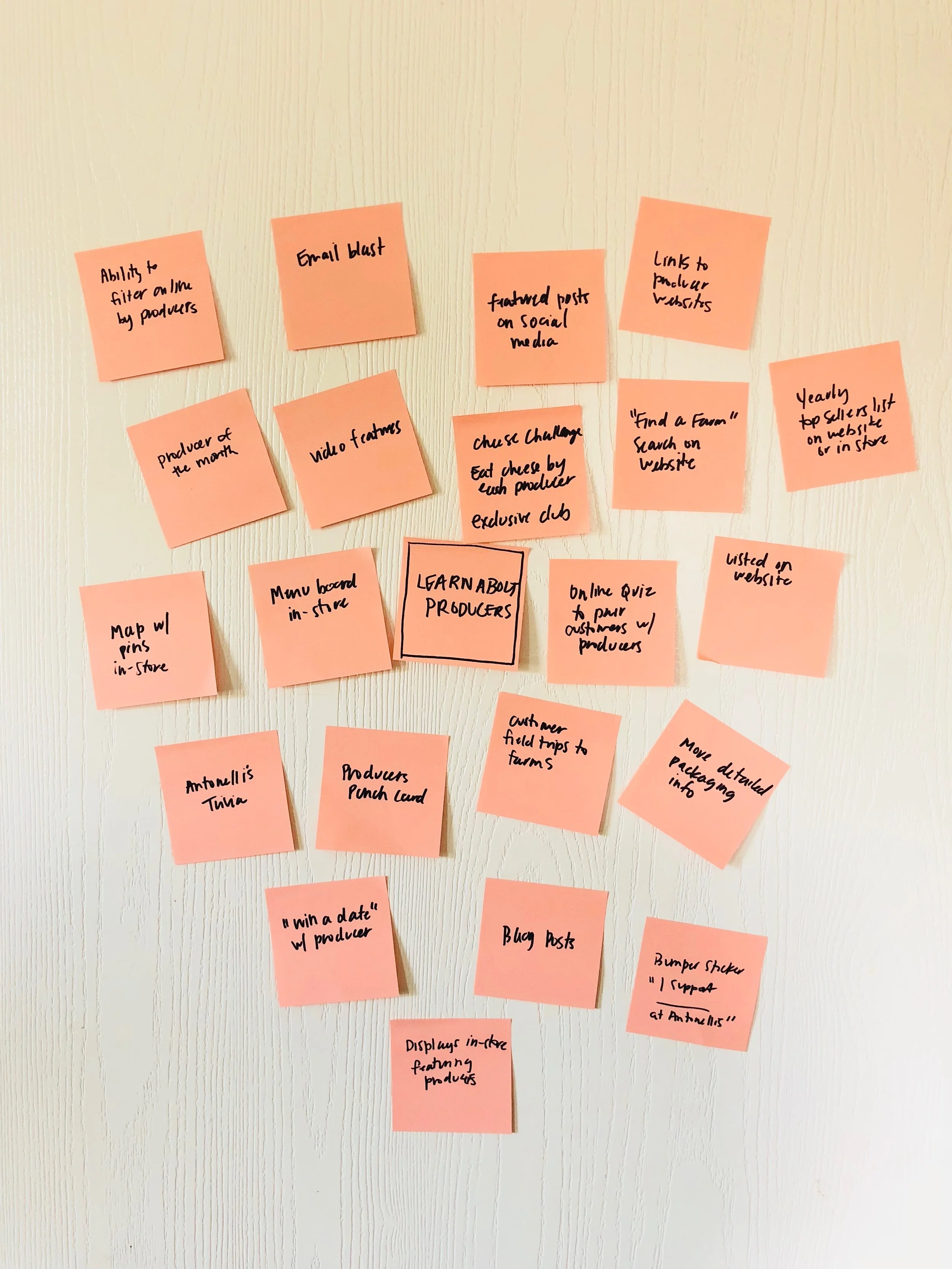
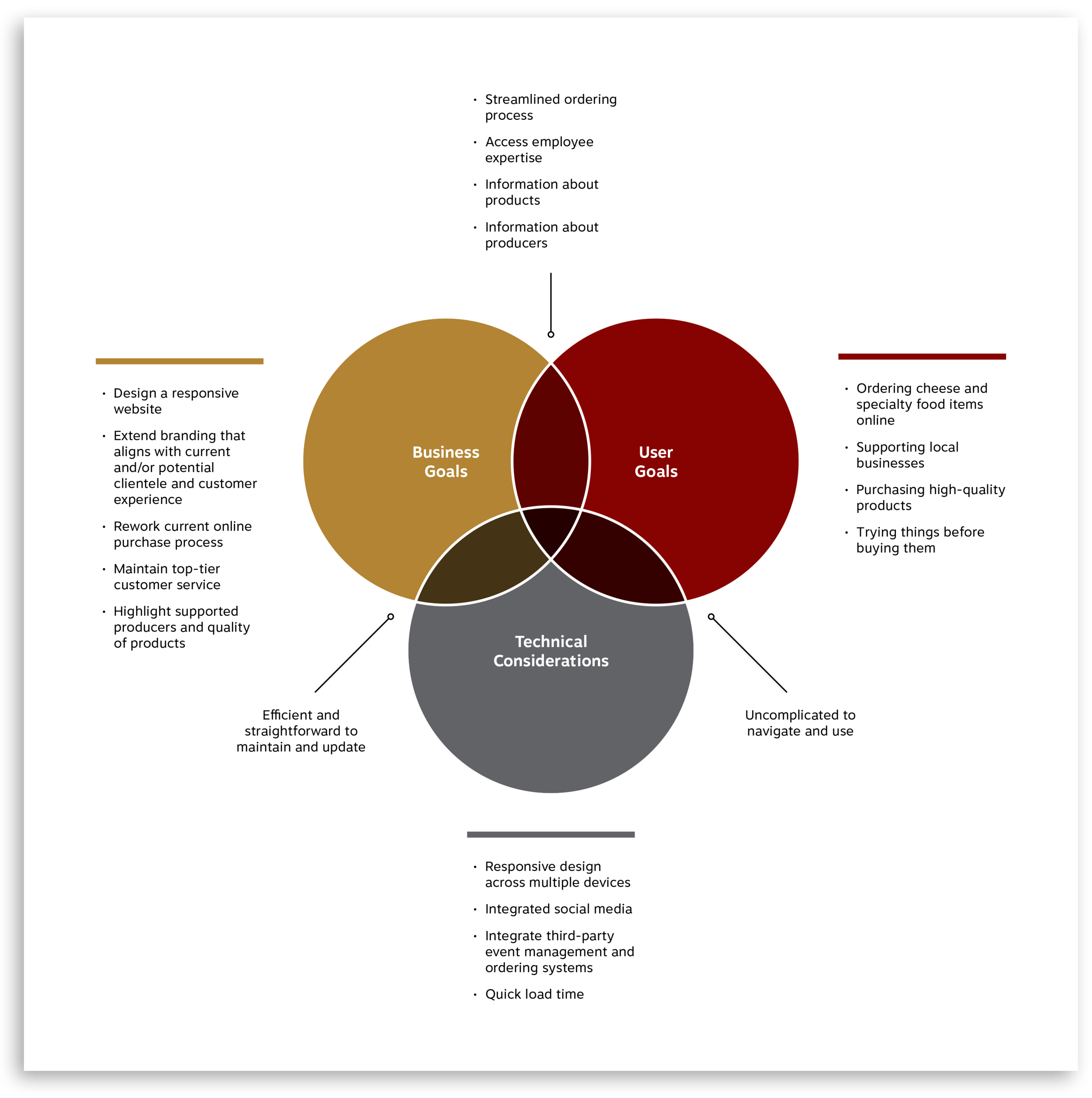
Comparing Business and User Goals
In an effort to cover all my bases, I combined business goals from the design brief and user goals from my empathy research, also taking into account technical considerations. The overlapping areas of this diagram identify, particularly between business goals and user goals, outlines project goals, where I will focus all my time and effort.
Prioritizing Solutions
With project goals identified, I created a product roadmap that prioritized goals, listing features that accomplish each. Prioritization was decided based in terms of development, investment, and importance to business and user goals. The roadmap also includes proposed metrics for measurement so that the impact and effectiveness of the features can be analyzed.
Assigning a Structure
Informed by the features and priorities outlined in my product roadmap, and considering Antonelli’s current website, I created a sitemap outlining the information architecture proposed for the new site.
Interaction Design
Charting a Path
With the site map established, I moved towards prototyping. I first created a task flow that identified a key task that all users complete in an identical way. Here, I mapped out the key screens users would interact with while trying to find more information about the producers that Antonelli’s supports.
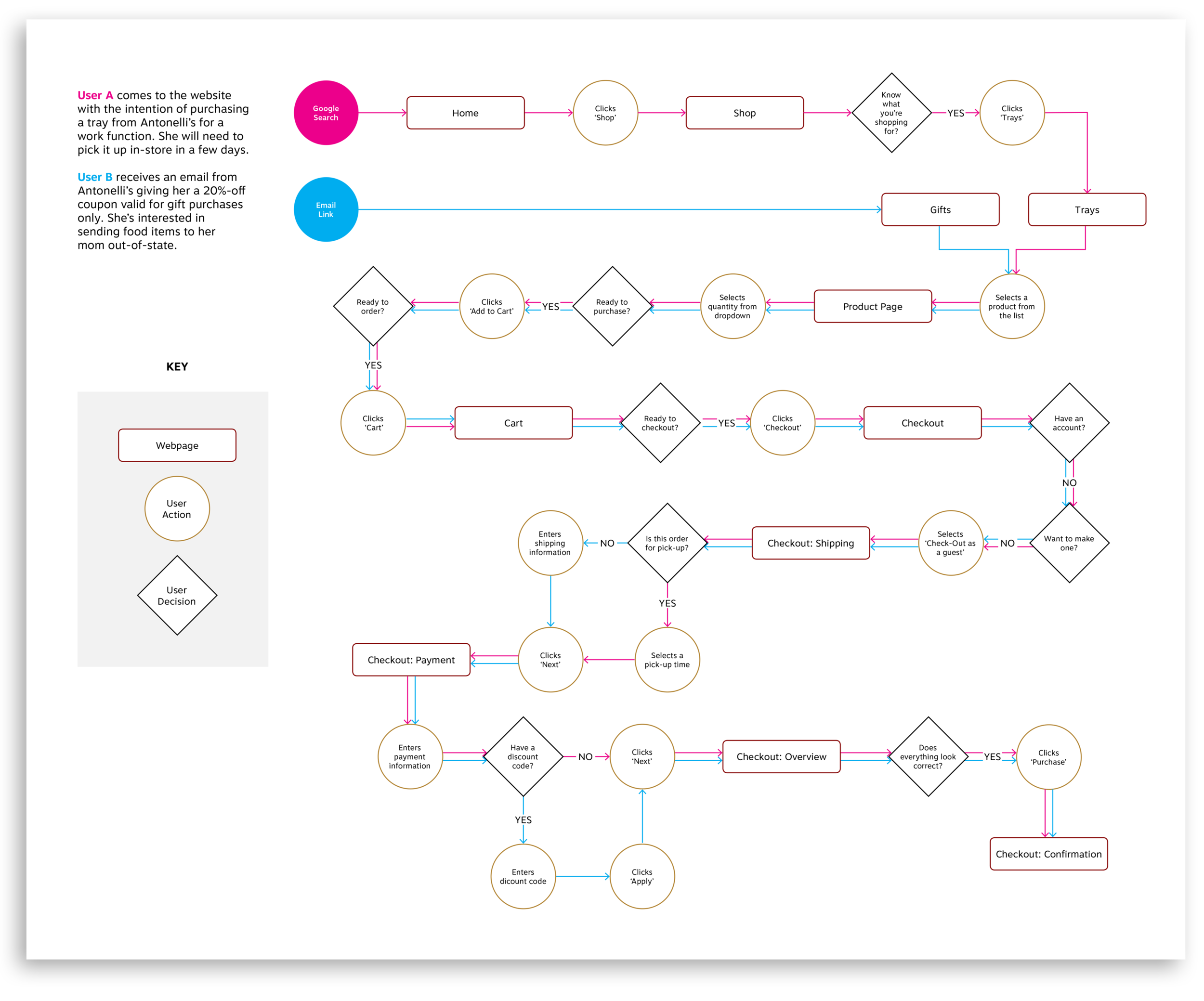
Then, going into even more detail, I created a user flow influenced by my persona’s needs and goals. Here, two users complete a purchase flow, but with different entry points and end goals. Mapping out a journey from beginning to end helped me account for key screens, as well as consider the flow, making sure everything made sense.
Referencing my site map and product roadmap, I created a detailed list of interface elements for pages based on the task and user flows I had researched. A UI requirements document allows stakeholders to assess and weight in on details of the site before they're implemented, and it served as a checklist for me as I began wireframing.
View UI Requirements here.
Laying It Out
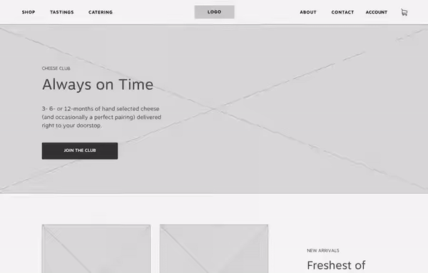
Based on my task and user flows, I created low-fidelity wireframe sketches. I accounted for key screens that users would interact with as they sought out producer information and completed a transaction. I referenced the sitemap and UI requirements to make sure I included priority elements for each page. Design patterns were also researched to make sure I was considering best practices.
I then took my sketches digital. Using Sketch, I created responsive mid-fidelity wireframes, refining a bit here and there. The goal was to create a more tangible view of the website for my prototype. As these were taking shape, I was already thinking about the tasks I would be testing users on.
With the key screens of the user flow designed, I employed InVision to create a mid-fidelity prototype for user testing.
This InVision Prototype is currently archived. Let me know if you'd like to view it.
Usability Testing
Usability Testing
Testing Users
Before speaking with users, I first outlined objectives, goals and procedures in a usability testing plan document. This served as a rubric during testing sessions.
View Usability Testing Plan here.
Five participants were asked to complete a series of two tasks outlined over two scenarios. It was important to me to conduct my usability testing in-person so I could observe not only verbal cues, but behavioral cues a well. I made notes as each user navigated the site.
Tasks
Navigate to a producer profile page, and choose a product to add to your cart.
Navigate to the shop section, and place an order for a tray.
Immediately, a few issues revealed themselves. The lack of a dropdown menu prevented users from completing tasks in the most direct way possible, and a bit of confusion surrounded adding on items to an order. But, overall, users completed tasks with less error than I anticipated.
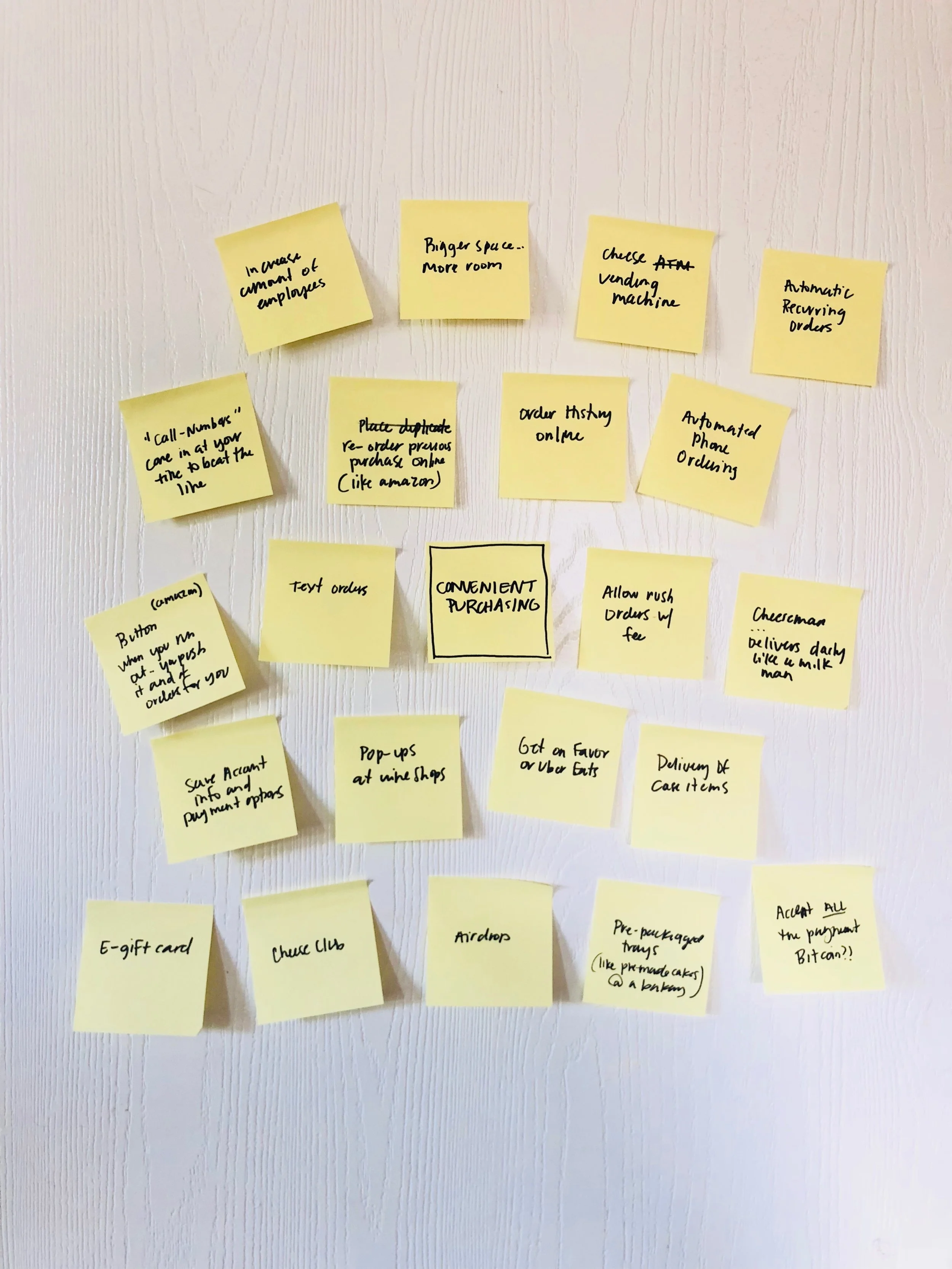
Prioritizing Revisions
I transcribed usability testing feedback, including observations and data, onto (virtual) Sticky notes, then organized according to patterns and trends. The affinity map I created helped to interpret and prioritize my findings.
The recommendations realized here served as a revision guideline for the next iteration of the website.
Insights
Users were confused by the lack of dropdown menu items
A lack of indicators caused user confusion when adding on items to their tray order
Users expect to be able to discover information about producers while they were in the shop
Users interacted with CTA buttons even when they weren’t asked to
Users had trouble deciphering between the homepage and about page layout because of similar heading size.
Recommendations
Create a dropdown menu for the main level navigation
Create a greater indicator action when add on items are selected
Add producer information and links within product pages to allow for discovery
Create a secondary button so users can tell between primary vs. secondary CTAs
Create a distinct header layout for the about page that differs from the homepage
View full Affinity Map here.
User Interface Design + Iteration
Establishing a Visual Direction
Knowing that I wanted to work with Antonelli’s existing branding, I looked for ways to refine and build upon it. I created a list of adjectives that described the current brand, including words that described the feeling of stepping foot into their physical space.
Friendly, relaxed, quaint, classic, local, timeless, authentic, cozy, welcoming, crafted, natural, responsible, quality, knowledgable
With the help of Pinterest, and I developed a mood board with visuals that suggested these ideas.
View Mood Board here.
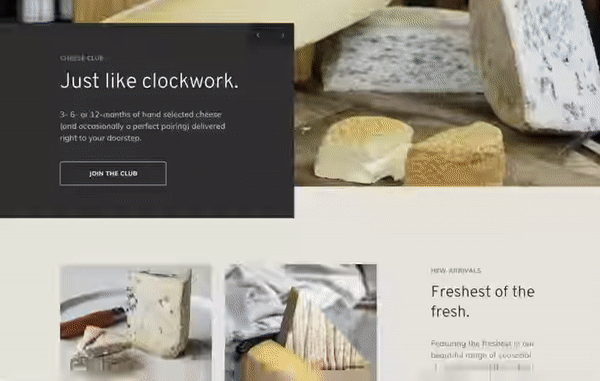
I then refined and developed the visual design direction, creating a style tile to show the color palette, typefaces, and imagery I would apply across the design of the new website.
Because Antonelli’s brands themselves inconsistently across a variety of spaces, I chose to establish a primary logo for them that I felt was the strongest for both web and print use.
Implementing Recommended Revisions
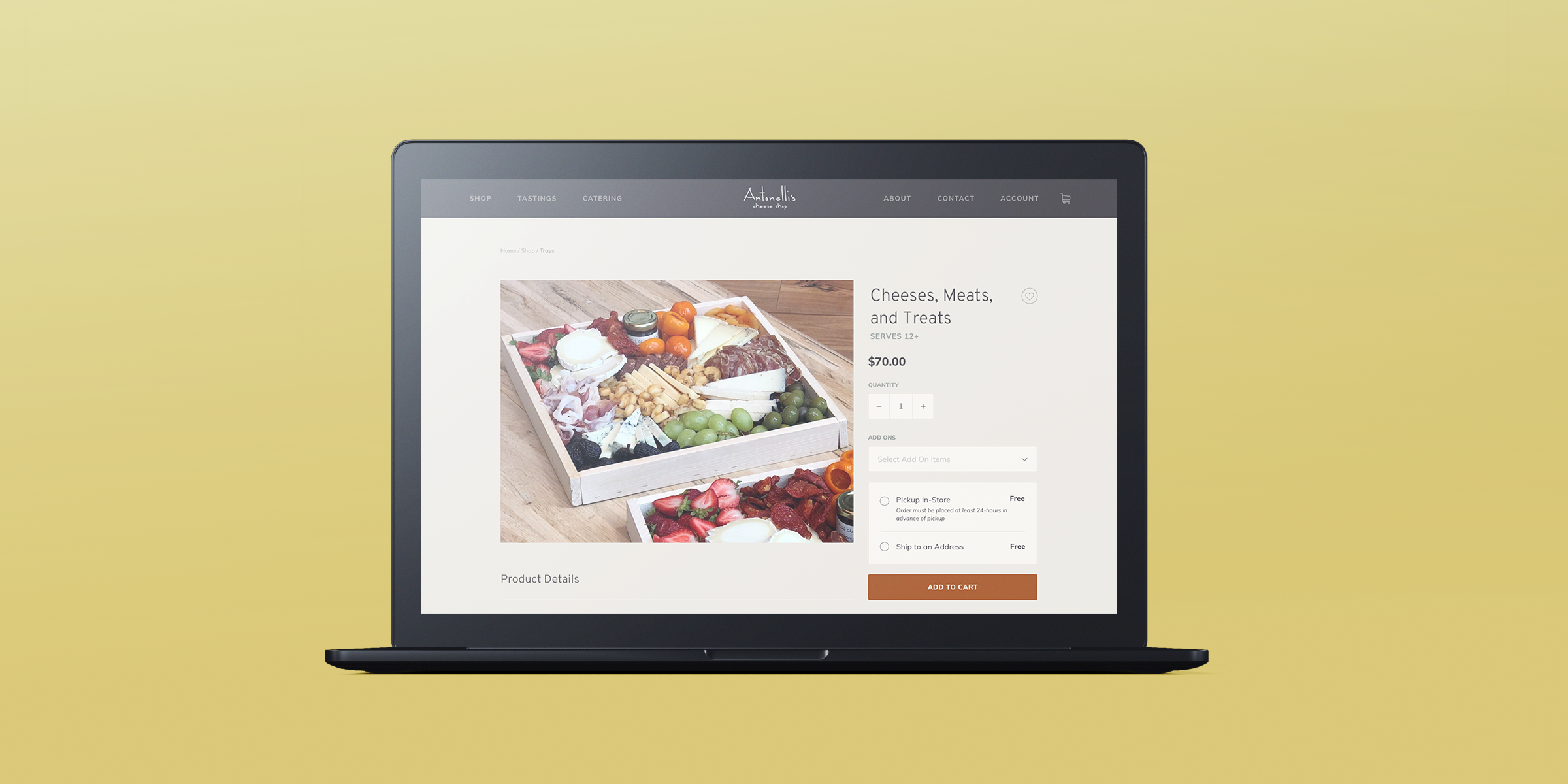
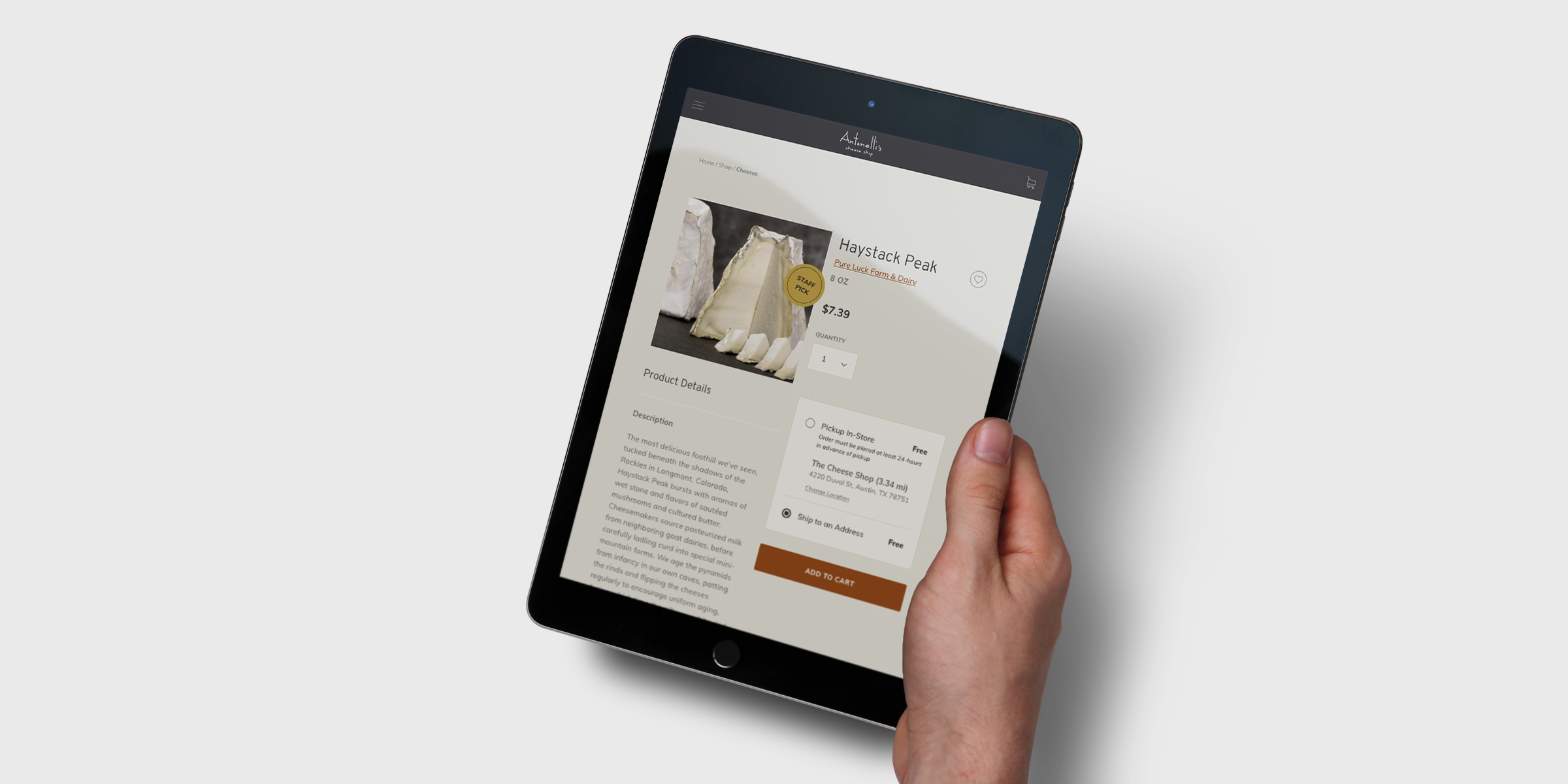
With a set of recommended revisions in hand from affinity mapping, I tweaked my previous designs to develop a set of responsive high-fidelity wireframes. These wireframes show how the visual design will be applied to the site and reflect changes made to the navigation and order flow.
Once again, I brought these wireframes into InVision to create a high-fidelity prototype. This prototype provides an opportunity for another round of user testing before going further with the site design and implementation.
Interact with this high-fidelity prototype here.
Finally, using elements of my high-fidelity wireframes, I crafted UI Kit to serve as a reference and resource guide for anyone working on the site. This document will be updated as the brand is built further and features are adopted or changed, to ensure the consistency of styles and elements used across the site.
Post-Mortem
Project Takeaways
Design patterns work, so use them. Users had little to no confusion completing a transaction in the checkout flow. By using already established design patterns, I didn’t have to build from scratch the checkout process, and was able to instead focus more on unique features of the site that needed extra attention.
Imagery is important. Working within limitations of the existing brand proved challenging when it came to sourcing photos. I was able to use stock images for the more broad features of the site, but product images had to come directly from Antonelli’s. These images are less than desirable, and really disconnect this section from the rest of the site.
Research done right just falls into place. In the past, the research phase of the process has been a struggle for me. This time around, I focused on narrowing my scope, outlining fewer (but stronger) goals and tailoring my asks to be more precise. I had more confidence in the process and was met with manageable data that I had no problem sifting through.
Next Steps
With more time, I'd like to update photos and establish an imagery guideline for Antonelli’s. Most of Antonelli’s product shots lack appeal, and seem disconnected from their staged photos. New pages were proposed and built during this process, forcing me to source some of the content from third-party locations.
Right now, Antonelli’s is using various iterations of their logo for their three spaces: Cheese Shop, Cheese House, Fareground. I’d like to create a solution, pulling from their current brand, that they can feel confident in implementing across the board. Perhaps integrating a second-level title or individual color schemes for each area could be a solution.
