UX/UI Design
Spotify
Music for Everyone

Role
Lead UX/UI Designer (Research, Interaction Design, Visual Design)
Timeline
80 hours over 4 weeks
With Spotify, it’s easy to find the right music for every moment—on your phone, your computer, your tablet and more.
Background
Spotify’s mission is clear: “to help people listen to whatever music they want, whenever they want, wherever they want—in a completely legal and accessible way.” As a streaming music service, Spotify is the group lead and it wants to stay that way.
Problem
Spotify needs help to define and design a new feature that will improve engagement and retention in their app by expanding their social capabilities.
Outcome
A newly integrated social feature for the Spotify mobile app provides an increased opportunity for users to engage with friends by recommending content to one another.

Research
Analyzing Secondary Data
Beginning with market research, I gathered existing data from secondary sources to gain a better sense of Spotify’s positioning within the music streaming landscape. I focused on Spotify’s share of the market, and what type of audience they are appealing to.
Spotify is leading the global music streaming service with 159 million monthly users, and 83 million subscribers
It holds 38% of the global streaming market share for subscriptions
Spotify’s music catalog includes over 30 million songs
72% of all weekly streams on Spotify are by millennials
67% of Spotify streams are through mobile devices
Millennials spend an average of 143 minutes streaming music every day
Americans spend more than 32 hours a week listening to music through streaming services.
From there, I conducted a competitive analysis comparing competitors’ strengths and weaknesses, as well as identifying where opportunities for Spotify to differentiate itself with a social feature might exist.
View Market Research and Competitive Analysis here.
I then created three provisional personas based on key demographics and behavioral traits of Spotify users. These personas helped me frame my interview planning and identify ideal interview subjects.
Next, I took time to acquaint myself with the mobile app. As a frequent Spotify user myself, I felt that I was fairly familiar with most of it’s features. While conducting an app audit, I uncovered some of the not-so-frequented areas of the app that other users might interact with on a regular basis. I was able to gain a better understanding of the app’s architecture, hierarchy and content, and while doing so, I couldn’t help but begin brainstorming new opportunities for the social feature.
View App Audit here.
Conducting Primary Research
After learning what I could from existing sources, I then gathered my own data related to Spotify. I first created an interview guide to serve as a rubric during 1-on-1 interviews, focusing on user’s music listening and sharing habits. I conducted seven in-person interviews over the course of two days. I recorded each session, took notes on observations, and later transcribed my findings into a single document for analysis.
Assumptions
Users prefer to access Spotify via the mobile app because of convenience.
Users are more likely to listen to music recommended by friends, as opposed to algorithm-based suggestions.
Users would like the ability to share music in-app in a more direct way.
View Interview Guide here.
Research Synthesis
Uncovering Insights and Identifying Needs
With the feedback gathered during user interviews, I created an empathy map to synthesize my findings. Observations and statements were organized on virtual sticky notes, then paired together with similar information, identifying themes and patterns.
Groupings uncovered user insights, then needs were identified.
Insights
Users seek out recommendations from those who share their musical interests.
Users employ a variety of workarounds to send music to friends.
Users enjoy conversing about music they are listening to.
Users like to listen to the playlists they have created together.
Needs
Users need the ability to connect with others who have a similar taste in music.
Users need the ability to directly share music with friends.
Users need a way to directly talk to others through the app.
Users need the ability to easily collaborate with friends to create playlists.
View full Empathy Map here.
Creating an Ideal Customer
Based on the insights and needs uncovered during my primary research synthesis, I established a user persona: Shannon Evans. Shannon is a music-obsessed millennial living in Austin, Texas. She sees herself as the tastemaker of her friend group, often sharing the music she’s listening to with others. She values collaboration and enjoys connecting with others over shared experiences.
Define, Ideate + Strategize
Defining the Design Problem
With a persona established, I moved into translating the insights and needs of Shannon into defined Point of View Statements, then crafted a set of How Might We Questions to guide my design. By defining the design challenge and framing it as a question, the roadwork for the ideation phase was paved for a range of innovative solutions.
How might we give Noelle access to reviews from trusted sources?
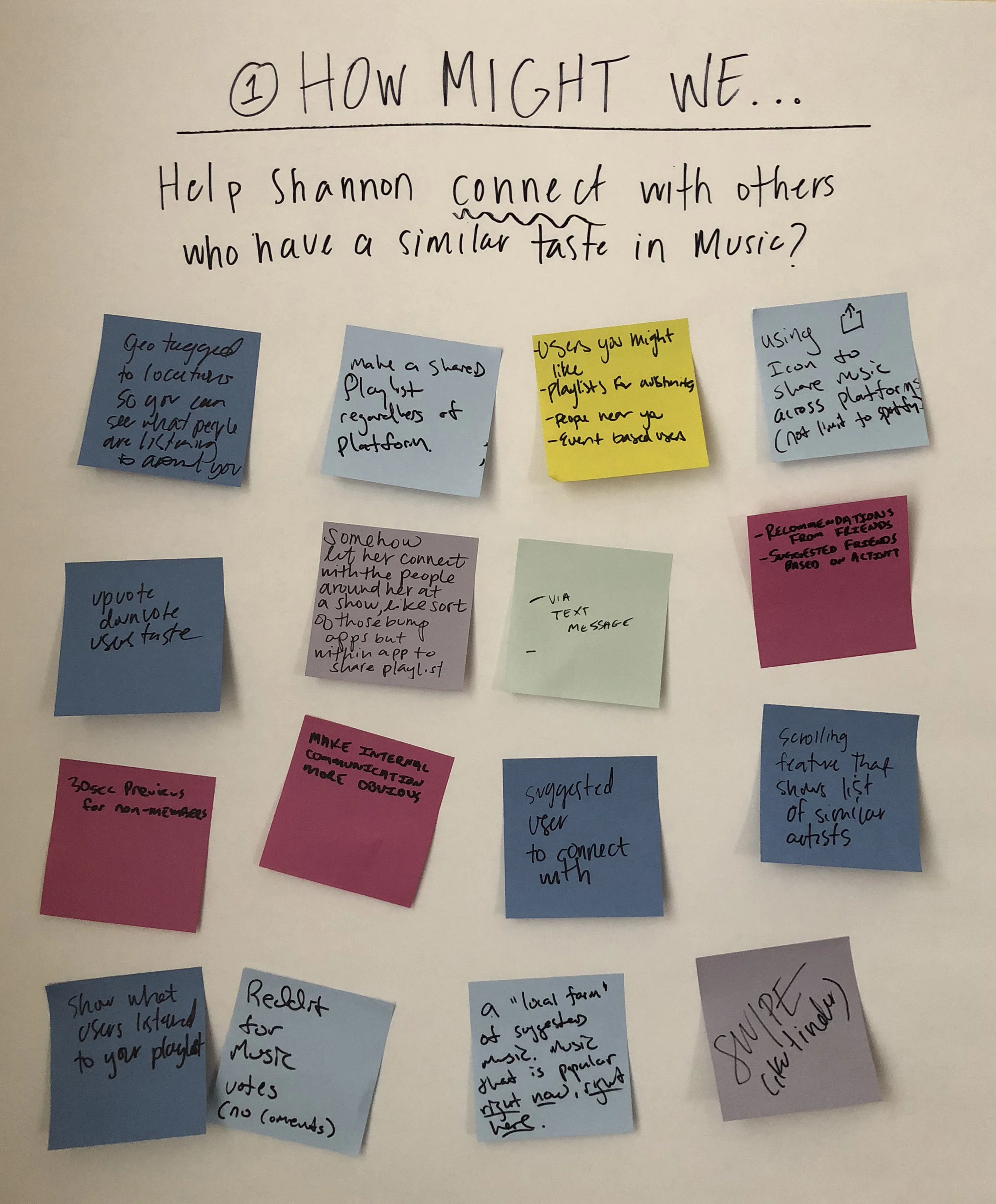
Generating Ideas
Next, I facilitated five participants in a group brainstorming session. For each HMW Question, the room brainstormed and discussed solutions, recording ideas on sticky notes. Gathering individuals with different experiences and perspectives provided the chance for me to gather a wider range of ideas than if I had been brainstorming solo.


Comparing Business and User Goals
To identify goals that consider both Spotify’s and Shannon’s priorities, I mapped out business goals, user goals, and technical considerations. The overlapping areas of this diagram identified the project goals, where I focused all my time and effort.

Prioritizing Solutions
Noting the shared user and business goals, I looked back at ideas generated during brainstorming and determined which ones could be further developed into a social feature that would respond to the needs of both parties. The product roadmap that was established outlines specific details for each, based on prioritization.
Assigning a Structure
Informed by the features and priorities outlined in my product roadmap, I created a revised app map for Spotify, showing how the new feature would integrate within the existing architecture of the app.
Interaction Design
Charting a Path
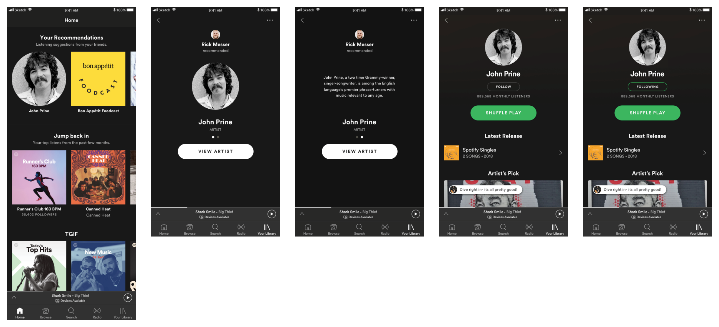
Referencing the app map, I created a user flow, thinking through three scenarios, showing three possible ways a user might interact with the new Recommendations feature. Thinking through each flow helped me identify key screens to design for the prototype I planned to test.
I then considered what interface elements each screen should include, and outlined them in a UI requirements document. This document served as an outline and checklist as I designed the key screens for the user flows, while conveying the planned functions and design elements to project stakeholders.
View UI Requirements here.
Laying It Out
I created low-fidelity wireframe sketches of key frames within the user flows I’d mapped out. These sketches helped me think through the integration of the new feature and layout before moving into digital renderings.
Working with Spotify’s exiting UI, I moved straight into designing high-fidelity wireframes. The goals was to develop a prototype that would allow me to test user interactions with the new feature in a context as authentic as possible to the real experience of the app.
With the key screens of the user flow designed, I created a high-fidelity prototype in InVision to share with users.

This InVision Prototype is currently archived. Let me know if you'd like to view it.
Usability Testing
Usability Testing
Testing Users
Before speaking with users, I first outlined objectives, goals and procedures in a usability testing plan document. This served as a guide during testing sessions.
View Usability Testing Plan here.
Five participants were asked to complete a series of three tasks tied to three scenarios during in-person testing. My goal was to discover if users could navigate to the feature in various ways, and share recommendations with friends.
Tasks
From the ‘Your Recommendations’ page, follow an artist or podcast that was suggested by a friend
Recommend the song that is currently playing to all available friends
From the user profile page, confirm a recipient of a recommended post
Overall, the flow and hierarchy of the feature met user expectations in terms of fitting within the current Spotify app. For the most part, participants were able to navigate the prototype successfully. But, there were a few pain points that caused confusion and prohibited users from completing tasks. This is where I focused my energy for implementing revisions.
Prioritizing Revisions
Referring to notes taken during user testing, I created post-its with observations and assessments for each test subject, looking for patterns and trends, then sorting accordingly. I then created an affinity map as a way of translating my observations to insights and recommendations.
The recommendations realized here served as a revision guideline for the next iteration of the feature design.
Insights
Users expected their recommendation history to live someone other than their user profile page
Users suggested toggle options be incorporated onto the recommendations listings
Users are concerned about controlling the amount of recommendations they receive from friends
Recommendations
Create a secondary location outside of the User Profile page to house recommendations by account holder
Add filtering options to Your Recommendations page so users have control over the content
Create ability to set restrictions on recommendations users receive
Because the majority of users had complications locating the user profile page (the screen that I chose to house a user’s history of their recommendations) I chose to prioritize adding a secondary location for this information. A solution was realized from the test subjects verbal feedback, as they told me they had expected this information to live alongside the recommendations they receive from their friends.
View full Affinity Map here.
User Interface Design + Iteration
Conforming to a Visual Direction
Because Spotify has a well-established brand, creating a mood board was an exercise in double-checking that my UI aligned with their visual direction. It was also an opportunity to gather inspiration that could be incorporated into the new feature.
View Mood Board here.
Pulling from Spotify's branding guidelines, I created a style tile using their existing color palette, typefaces, and imagery, including any new elements specific to the new Recommendations feature.
Implementing Recommended Revisions
With a set of recommended revisions in hand from affinity mapping, I tweaked my previous designs to develop a second set of high-fidelity wireframes.


Once again, I brought these wireframes into InVision to create a high-fidelity prototype. This prototype provides an opportunity for another round of user testing before going further with the app design and implementation.
I then assembled a UI Kit, drawing upon existing Spotify UI styles and elements and adding new styles and elements specific to the Recommendations feature. This provided an opportunity to review styles, design patterns, and UI elements for consistency.
Post-Mortem
Project Takeaways
Spend time cracking the code. Designing within the constraints of an already established (and highly successful) visual design system was the most challenging aspect of this project. In creating this new feature, I felt an almost daunting sense of responsibility to acquaint myself with and maintain Spotify’s mission. Only once I spent time dissecting the current design and all it’s nuances, did I feel confident moving forward to introduce something new.
It’s okay to backtrack. The initial focus of my integrated feature was a Friend Feed that would allow users to interact by posting, commenting, and liking other’s created content. I quickly realized that this feature, although well-liked and agreed upon in my brainstorming session, was beginning to feel less like it belonged in within a music streaming app, and more like it belonged in a social app. I revisited the drawing board, stripping most of the social capabilities out of the feature, and realigned it to better fit within Spotify’s current mission of putting the music first.
Being intimately familiar with a product doesn’t make me an expert. Even as a regular Spotify user, I quickly realized how little I knew about the app. While it was easy for me to insert my own ideas into this project, I couldn’t let it distract me from who I was really designing for—the user. I learned a valuable lesson in taking a step back and being prepared to design for experiences that may differ from my own.
Next Steps
With more time, I’d like to explore the best way to offer privacy controls to users, specifically in context of the Recommendations feature. Because the control of information was a common theme for most users, introducing a social feature without the ability to tailor shared content seems almost irresponsible.
Next on the list would be to tackle additional features outlined in my product roadmap, particularly increasing the ability for users to find and connect with friends. Many simple solutions I have outlined would, I believe, make a huge difference.

More Projects

Bhuku
App Design

Antonelli’s Cheese Shop
Responsive Web Design

Zeit
Responsive Web Design